donderdag 28 februari 2019

DATA JOURNALISTS: WHAT DO YOU KNOW ABOUT KAGGLE? (1)


I was looking for an instructive data set to use at a data journalism training. After World Bank data focusing on GDP and life expectancy, or sovereign debt and sovereign ratings from Trading Economics, or financial inclusion, I needed a fresh start; something new, interesting, and journalistic. Also it had to be general, that is appropriate for a group of African journalist. In December I worked on the Economist Big Mac index for African countries. 
Wondering around I jumped into kaggle.....


Musing about Economist data, I remembered vaguely something about Olympic medals. For example this one: https://www.economist.com/graphic-detail/2016/08/23/the-rich-are-different-at-the-olympics , about predicting winners based on GDP per capita. Interesting graphic but no data.
Next looking for a database for the Olympics. After playing and tuning Google I came to unknown territory: https://www.kaggle.com/the-guardian/olympic-games#dictionary.csv . This was data from the guardian analyzing summer and winter games and also dat about the countries. Very interesting data. But let's first check the source.

What is kaggle.com ? 
 A Wikipedia article turned up say that it was a Google site, for data scientist and machine learning, exchanging ideas, data, and prediction models (https://en.wikipedia.org/wiki/Kaggle ). Oh and they share data sets and coding for analyzing these data sets, called kernels. The coding has two flavors: Python or R. So that means you can look for data set and the coding and immediately have the analysis with visualizations. Read more about kaggle: https://medium.com/implodinggradients/should-you-kaggle-5b8dbdef442f

Browsing a bit deeper in kaggle I run into an Olympic dataset with bio data of the athletes. https://www.kaggle.com/heesoo37/120-years-of-olympic-history-athletes-and-results

Next dive in the kernels
Focusing on R and Olympics. The first one based on 'hottest' or most popular, blows me away completely. A full analysis, with table of content and chapters, with text and visualizations, and push the button “code”and you have an R script ready to run in Rstudio.

The most important part is the competition. Various groups of data sciences are competing with each other to develop a model that produces the reliable predictions. For example this earth quake prediction model: https://www.kaggle.com/c/LANL-Earthquake-Prediction .

Kaggle looks like a data goldmine; it combine interesting data sets with coding, and is useful for creating assignments and just showing how to do an analysis. Python is favored above R. R is more for statisticians, cracking data and Python, Panda's, Jupyter notebook more for developers aiming at machine learning. More about the difference between R and Python: https://medium.com/@data_driven/python-vs-r-for-data-science-and-the-winner-is-3ebb1a968197

You want to learn Python or R
Here are some links:


donderdag 21 februari 2019

And even more viz tools

In December at Highway Africa conference I did a workshop about 'data journalism made easy': from Flourish to Workbenchdata. More and more tools for analysis and visualization are available for data diggers.
Oh serendipity, when playing with Google analytics....I found a new Google tool: Data Studio.   This is welcome page that provides some background about this viz tool. Click on the right top corner link or go to datastudio.google.com; login with your google account. Create a new report and select the data source. I simple choose for uploading some .csv data. Then insert the type of graphic you want. All the standard options from bars to scatter plots are available. Even maps work fine when you select a continent or a part of that continent.
BUT: you export your graphs as a report, that is pdf!; haven't seen an embed option.


zondag 17 februari 2019

GUI for R ggplot

In data journalism training I often use Tableau to make visualizations. Fast and easy. However sometimes we do analysis of data not in Excel but using Rstats. Plotting data with ggplot is not so easy, because of the variables you have to define.

Now there is a new package 'esquisse' (sketch) , based on Shiny, that works as a GUI for ggplot2. Install the package and start the GUI for ggplot from the addin menu or from the console: esquisse::esquisser  Don't tag the package. Select a data file. In the example below I use GDP and life expectancy for Sub Sahara African countries. At the bottom line you can do fine tuning for labels, colors and theme, select data and export the plot.
See for example my static blog using R blogdown:
https://d3media.netlify.com/post/export-code-from-esquisse-for-ggplot/


maandag 11 februari 2019

Write your blogs in R STUDIO with Markdown

You are working in R and want to show or export your code? Simple we use R markdown. Create a markdown - Rmd - doc with your code and comments. Then export the Rmd with Knit to Word, Pdf or html.
Publishing your R Code directly is not complicated using the new package blogdown. Blogdown is an effort to integrate R markdown with open source static web generators like Hugo. To deploy your blog  with the Rmarkdown use Netlify, a platform for managing and deploying modern web projects.
Below is the workflow.


maandag 4 februari 2019

De de-kolonisatie van het internet

Habermas zou misschien glimlachend hebben meegeluisterd.  Vorige maand organiseerde Meetup Arhem in Villa Sonsbeek een discussieavond onder de titel”Het internet is stuk”.   Geert-Jan Bogaerts, hoofd digitaal van de VPRO, presenteerde hier het plan PublicSpacesPublicSpaces verzet tegen de kolonisering van het internet door de digitale grootmachten: Facebook, Google etc. Een soort “Strukturwandel der Öffentlichkeit”, maar dan digitaal. Immers in het begin was het internet een open en decentrale ruimte die vergezichten opriep van vrijheid en discussie;  een “electronic town hall” vergelijkbaar met de Atheense democratie schreef Al Gore.  Nu is het internet stuk.

zondag 3 februari 2019

TWO TRENDS IN DATA JOURNALISM

In this blog post I am trying to synthesize my thinking about tools and developments in data journalism.

Data journalism is getting easier. Writing difficult formulas in Excel or doing  a database join in order to make a map in Google Fusion Tables is over.  The last years new software is developed and available to do data journalism. Every reporter and editor should be able to work with these new web based services for reporting data stories. Data wrapper is already a classic, but Workbenchdata and Flourish are new easy use tools.

R Project
The digging deeper in data and visualizing complicated relationships need another approach. R project is an interesting candidate, and there are good reasons to use R in journalism. Two British media, the Economist and the BBC have published data journalism stories based on R. At Birmingham City University is Paul Bradshaw training journalism students in an MA for these job in R and coding.
So there is an movement into the opposite direction. Data journalism is getting more complicated by  integrating skills and tools of computer science and statistical analysis.

Economist
The Big Mac index by the Economist is a nice example. This index tries to establish whether  currencies are over or undervalued. The data and the calculations in R for the Big Mac index are published  at Github  as a Jupyter Notebook .

BBC
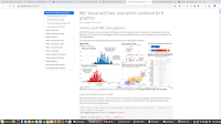
The BBC got also into R especially for making graphs with ggplot and the need for standardization of that production. Datajournalists at the BBC developed their own package in R to do the work called bbplot. Every R user can install this package and start producing graphs the BBC way. Working with R is not self evident and beginners need some help. That is the cookbook of the BBC , with recipes for various graphs from line to bar or scatter diagrams.
It is remarkable when the BBC writes: “We don’t use it for interactive graphics, for which the Javascript library D3 is better suited….or static charts we’ve found R and ggplot2 to be very useful”. D3 is a good choose, but you need java script and the D3 library to do that work which something completely different. I think it would be easier to use plotly for exporting ggplots, or use R's Shiny server for interactive graphs.

I am quite enthusiastic about this development in data journalism. In times of diseases like fake news and Facebook manipulation is fact-based reporting the only medicine.