In this blog post I am trying to synthesize my thinking about tools and developments in data journalism.
 Data journalism is getting easier. Writing difficult formulas in Excel or doing a database join in order to make a map in Google Fusion Tables is over. The last years new software is developed and available to do data journalism. Every reporter and editor should be able to work with these new web based services for reporting data stories. Data wrapper is already a classic, but Workbenchdata and Flourish are new easy use tools.
R Project
The digging deeper in data and visualizing complicated relationships need another approach. R project is an interesting candidate, and there are good reasons to use R in journalism. Two British media, the Economist and the BBC have published data journalism stories based on R. At Birmingham City University is Paul Bradshaw training journalism students in an MA for these job in R and coding.
So there is an movement into the opposite direction. Data journalism is getting more complicated by integrating skills and tools of computer science and statistical analysis.
Economist
 The Big Mac index by the Economist is a nice example. This index tries to establish whether currencies are over or undervalued. The data and the calculations in R for the Big Mac index are published at Github as a Jupyter Notebook .
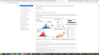
BBC
The BBC got also into R especially for making graphs with ggplot and the need for standardization of that production. Datajournalists at the BBC developed their own package in R to do the work called bbplot. Every R user can install this package and start producing graphs the BBC way. Working with R is not self evident and beginners need some help. That is the cookbook of the BBC , with recipes for various graphs from line to bar or scatter diagrams.
It is remarkable when the BBC writes: “We don’t use it for interactive graphics, for which the Javascript library D3 is better suited….or static charts we’ve found R and ggplot2 to be very useful”. D3 is a good choose, but you need java script and the D3 library to do that work which something completely different. I think it would be easier to use plotly for exporting ggplots, or use R's Shiny server for interactive graphs.
I am quite enthusiastic about this development in data journalism. In times of diseases like fake news and Facebook manipulation is fact-based reporting the only medicine.
Background
About Flourish:
https://d3-media.blogspot.com/2018/02/diy-data-journalism-charts.html
About Flourish versus R
https://d3-media.blogspot.com/2018/02/how-to-analyze-from-flourish-into-r.html
About R versus Python
Journalists who want to dig deeper in data can use two tools, either R or Python. It seems that persons with a statistical background choose R and those with a coding background prefer Python.
https://medium.com/@thomascherickal/python-versus-r-which-should-you-choose-for-data-science- 13e7f6567d07
If you to have all this software - R, Python,Jupyter - together in one application, install anaconda and run anaconda-navigator to get to all the tools.
About Github
(https://www.economist.com/the-economist-explains/2018/06/18/what-is-github)
About Jupyter Notebooks
https://d3-media.blogspot.com/2017/09/jupyter-notebook.html
 Data journalism is getting easier. Writing difficult formulas in Excel or doing a database join in order to make a map in Google Fusion Tables is over. The last years new software is developed and available to do data journalism. Every reporter and editor should be able to work with these new web based services for reporting data stories. Data wrapper is already a classic, but Workbenchdata and Flourish are new easy use tools.
R Project
The digging deeper in data and visualizing complicated relationships need another approach. R project is an interesting candidate, and there are good reasons to use R in journalism. Two British media, the Economist and the BBC have published data journalism stories based on R. At Birmingham City University is Paul Bradshaw training journalism students in an MA for these job in R and coding.
So there is an movement into the opposite direction. Data journalism is getting more complicated by integrating skills and tools of computer science and statistical analysis.
Economist
 The Big Mac index by the Economist is a nice example. This index tries to establish whether currencies are over or undervalued. The data and the calculations in R for the Big Mac index are published at Github as a Jupyter Notebook .
BBC
The BBC got also into R especially for making graphs with ggplot and the need for standardization of that production. Datajournalists at the BBC developed their own package in R to do the work called bbplot. Every R user can install this package and start producing graphs the BBC way. Working with R is not self evident and beginners need some help. That is the cookbook of the BBC , with recipes for various graphs from line to bar or scatter diagrams.
It is remarkable when the BBC writes: “We don’t use it for interactive graphics, for which the Javascript library D3 is better suited….or static charts we’ve found R and ggplot2 to be very useful”. D3 is a good choose, but you need java script and the D3 library to do that work which something completely different. I think it would be easier to use plotly for exporting ggplots, or use R's Shiny server for interactive graphs.
I am quite enthusiastic about this development in data journalism. In times of diseases like fake news and Facebook manipulation is fact-based reporting the only medicine.
Background
About Flourish:
https://d3-media.blogspot.com/2018/02/diy-data-journalism-charts.html
About Flourish versus R
https://d3-media.blogspot.com/2018/02/how-to-analyze-from-flourish-into-r.html
About R versus Python
Journalists who want to dig deeper in data can use two tools, either R or Python. It seems that persons with a statistical background choose R and those with a coding background prefer Python.
https://medium.com/@thomascherickal/python-versus-r-which-should-you-choose-for-data-science- 13e7f6567d07
If you to have all this software - R, Python,Jupyter - together in one application, install anaconda and run anaconda-navigator to get to all the tools.
About Github
(https://www.economist.com/the-economist-explains/2018/06/18/what-is-github)
About Jupyter Notebooks
Geen opmerkingen:
Een reactie posten
Opmerking: Alleen leden van deze blog kunnen een reactie posten.