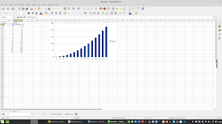
For data journalism chatGPT open news perspectives as well. Here are two examples related to simple data tasks in Calc and R. Chat GPT creates the R code and gives a howto for Calc.
Here is one way to calculate the squares of the first 10 numbers in R:
# Create a vector of the first 10 numbers
numbers <- 1:10
# Calculate the squares of the numbers
squares <- numbers^2
# Print the result
squares
This will output the following vector: 1 4 9 16 25 36 49 64 81 100.
Can you make a bar graph of this output
Certainly! Here is one way to create a bar graph of the squares of the first 10 numbers in R using the ggplot2 package:
# Load the ggplot2 package
library(ggplot2)
# Create a data frame with the numbers and their squares
df <- data.frame(numbers, squares)
# Create the bar graph
ggplot(df, aes(x = numbers, y = squares)) +
geom_col()
This will create a bar graph with the numbers on the x-axis and the squares on the y-axis. The bars will represent the squares of the corresponding numbers.
You can customize the appearance of the graph by adding additional layers to the ggplot function. For example, you can change the appearance of the bars using the fill parameter, or add a title using the ggtitle function.
Here is an example of a customized bar graph:
ggplot(df, aes(x = numbers, y = squares)) +
geom_col(fill = "orange") +
ggtitle("Squares of the First 10 Numbers") +
theme_minimal()
This will create a bar graph with orange bars and a title. The theme_minimal function sets a minimalistic theme for the graph.
Make a bar graph of the square of the first 10 numbers in Calc(open office)
To create a bar graph of the results of the squares of the first 10 numbers in Calc, you can follow these steps:
1. Enter the numbers you want to square in cells A1 through A10.
2. In cells B1 through B10, enter the formulas to calculate the squares of the numbers in cells A1 through A10. You can use either the =POWER(A1, 2) or =A1^2 formula, as described in my previous response.
3. Select the range of cells containing the numbers and the squares (e.g., A1:B10).
4. Click the "Insert" tab and then click the "Bar" button in the "Charts" group.
5. From the list of chart types that appears, choose the type of bar chart you want to create (e.g., "Clustered Bar," "Stacked Bar," etc.).
6. A bar chart will be inserted in your spreadsheet, showing the squares of the first 10 numbers.
7. To customize the appearance of the chart, you can right-click on it and select "Format Chart Area" to open the "Format Chart Area" dialog box. From here, you can change the colors, fonts, and other formatting options for the chart.
I hope this helps! Let me know if you have any questions.


Geen opmerkingen:
Een reactie posten
Opmerking: Alleen leden van deze blog kunnen een reactie posten.